My DS is attending a friend's birthday tomorrow and I've been wanting to make a shadow box card for Challenge #13 for the Stampin' Sisters in Christ. I also wanted to use some of my darling PMS stamps that I've been collecting! Right now PMS is having a blog hop and in conjunction with their Makeup 4 the Week-end Challenge. The challenge is to use Olive, Navy & Mustard on your card. So here is my Olive, Navy & Mustard Shadowbox!
I colored Rex with my Copic markers. I used the Out of the Box technique with this shadowbox. I thought it would be fun when DS's friend opens the card! He is turning 7 so I think he'll like it.
I used Just For Fun's grass stamp. That little grass stamp comes in quite handy! Here is a top view so you can see the shadowbox depth. The tutorial for this shadowbox is at SCS here.
So, do you think he'll like it?
Stamps: Rex & sentiment (PMS), Grass (JFF), Ink: Old Olive, Rich Cocoa (Momento) Paper: Night of Navy, Old Olive, Whisper White, More Mustard; Accessories: Copic Markers, Pop Dots, Coluzzle.
21 November 2009
Roaring Birthday


28 October 2007
Zee Fun is in Z Fold!
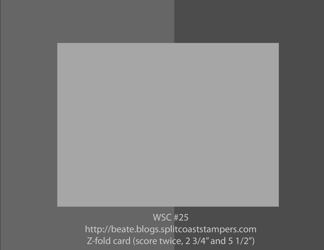
I decided to play along with Beate's week-end Sketch Challenge #25. The sketch is quite straightforward, the Challenge was that it had to be a Z Fold card. Beate's challenge can be found here. The sketch is here.
Now you might be wondering about my card. Well. . . . . . I made two! No I'm not an overachiever! (I don't think so anyway!) A friend/neighbor had her baby on Thursday (so she couldn't attend my monthly class - what an excuse, right!?) So I decided to make one of the cards for her and her family.  Stamps: A New Little Someone, Ink: Staz-On Black, various SU Markers; Paper: Regal Rose (inside), Rose Red, Pallet O'Prints, Old World Mat Stack (DCWV - purple DS).
This card I am planning on sending to my Distance Stampers Group. Yes, I have a few more of these to make! So I had better get started! LOL! Now, when I scanned this card, some of the Old Olive color washed out of the designer paper (left side), so it does coordinate better IRL.  Stamps: True Friend, Ink: Staz-On Black, Old Olive & Really Rust Markers, Paper: Old Olive (inside) Really Rust, Apple Cider DP. Accessories: Rhinestone Brads Ice.
In case you are wondering, I found the Z fold tutorial on the subscriber pages of Technique Junkies.
05 September 2007
True Cider Friend
Well, I had to come up with some name for this posting so I guess that will work! ;) Now that my son has started back at pre-school, hopefully I'll be able to get into a rhythm and have some more time for stamping! I forgot to grab the camera as he got on the preK bus today! *sigh*
I was playing with the new set True Friend from the Holiday Mini and this is what I came up with. I was inspired by this Christmas card by Paula. It was really a pretty simple card to put together. Believe it or not I didn't try to line up the wheeled background so it was pretty cool that it turned out like it did! I thought I'd send this to my "little" brother (Wade) serving in South Korea right now. Hmmmm, I do "owe" him a birthday card still! ;) Stamps: True Friend, Boho Friends wheel; Ink: VersaMark (wheel), Sahara Sand; Paper: River Rock, Really Rust, Cider Designer Paper; Accessories: Antique brads, Horizontal punch, 1/16" hole punch, Corner rounder & Chocolate Chip Taffeta Ribbon.
22 August 2007
August's Class Projects
I had my monthly Class yesterday, the day after I hosted aPampered Chef party. Whew! But at least I only had to clean the house once! ;)
The first project we did was this card using the Double Rainbow technique from Technique Junkies, (LOVE that newsletter!) I originally was making this for my Brother's birthday (he's stationed in Korea right now.) I showed it to my DH and he scrunched his nose and commented on it being really "orange". Hmmmm, well, the Pumpkin Patch Spectrum pad only has one orange, the other colors are Really Rust, Ruby Red, More Mustard and Old Olive. That doesn't seem like too much orange to me! Besides, look at all that black and green!!! *grrrr* *deep breath* So back to the drawing board for his card, but I still liked this card and the technique used so I used it for my class. Stamps: With Gratitude; Ink: Pumpkin Patch Spectrum, White CRAFT, Basic Black, VersaMark; Paper: Green Galore, Basic Black, Glossy; Accessories: Brayer, Crop-A-Dile, Black eyelets, White Emboss Powder.
One of my regular customers is pregnant and due in a couple months and I had talked to her about doing a pocket card for birth announcements. I decided to do a pocket card this month to show her how easy they are. (Wouldn't you know she couldn't make it this month, but she came to my PC party and I showed her there.) ;) Here is the inside layer pulled up so you can see. Perhaps I'll send this one to my brother, certainly I couldn't go wrong with green and blue could I?!
 Stamps: On the Spot B/G, Seeing Spots, Little Pieces, Hugs and Wishes; Ink: Brilliant Blue, Certainly Celery, Old Olive (that little pieces circle punched out on the center of the blue circle); Paper: Bashful Blue, Certainly Celery, Brilliant Blue; Accessories: Certainly Celery 5/8" Grosgrain and Night of Navy 1/4" Grosgrain Ribbon, Rounded Tab punch, 1/2" circle punch, 1 1/4" circle punch, Sticky Strip.
07 May 2007
May's Class
May is here already! My class for this month will be on Tuesday evening the 15th at 6:30pm and Wednesday morning the 16th at 10am. I apologize to those that received an email with a date of the 17th. My DH is leaving town to attend a surprise birthday party for someone special to him and I think it would be best if the night before he leaves I'm not filling the house with stampin' women! ;)


This fold is really simple. I still want to put "something" in the lower left corner to help keep the top fold in place. I haven't decided whether to use a punch or stamp and cut out "something". Oh and the Sage Shaddow looks better IRL. I really like how this turned out. I think it looks good without the girls colored in, but I'm sure would look good colored in as well.
I left the inside blank rather than stamp something to provide a place to write. It would be simple to just not stamp on one of the flaps for writing space and stamp a word saying or pictures on the Vanilla layer. I may still doodle around the edges to help it not look so bare. I don't like my class projects to be too involved so I want to be cautious with this project and not go overboard.
I hope they enjoy it! :D
24 April 2007
April's Class Projects
Well, it is that time of the month again! ;) Yes, time for my monthly class. So far I have two people RSVP'd to attend. For our projects I have selected a Crayon Resist and a Diagonal Tri-Fold.
The Crayon Resist is soooo very simple. Directions can be found on Splitcoast stampers in their resource area. I used Cameo Coral, Blush Blossom and Basic Black for this card. I also used both the large and small oval punches. I popped the small oval on the inside and used the large oval to cut out the top layer so you can see it, and used Stampin' Dimensionals under the small oval. The scanner made that part look strange! My inspiration for this card came from Julie at Rubber Room Ramblings.
For the second card, I went to Julia again for inspiration with her Diagonal Tri-fold card. I used Old Olive, So Saffron, Shimmery White and Oxford Designer Paper. I used the Photo Corners tutorial from Splitcoast. The brads are just the Stampin' Up! gold; it is difficult to tell in the scan. IRL the Oxford paper matches better than the scan shows!

Here is the card open:

I wish I could figure out how to make the pictures "clickable" so you can click and enlarge them. I know that it has something to do with the HTML, I just don't know how to edit it so it will work. I'm not doing anything different than the other pictures that will click to enlarge. Hopefully one day (soon) I'll figure it all out!
Okay, my brain is fried and I have to get up in a couple of hours to get Troy to school, so I'm done for now.
11 April 2007
Tri-fold Birthday
 My scanner washed out alot of the color on the white layer. I had sponged some Garden Green, True Thyme, some Creamy Caramel (in the center) and a hint of Ballet Blue. The vine is stamped with Olive Green StazOn, and the monkey using Timber Brown. The white layer(s) are shimmery white. (I am really loving the shimmery white card stock, WHY did I wait so long to start using it?????)
Here is the card open. As you can see, my monkey "swung" to the side. The designer paper was a holdover from the original idea of using the Knobbly Gnomes, but being that it is masculine, (and in the attempt NOT to hoard it any longer) I wanted to keep it. I am trying to incorporate more designer papers into my card making.
Stamps: Monkey Business, Cheery Chat;
Ink: Olive Green and Timber Brown Staz-On, Ballet Blue, Garden Green, True Thyme, Creamy Caramel, Bordering Blue (stamped off) and Almost Artichoke;
Paper: Ballet Blue, Almost Artichoke, Shimmery White and Oxford Designer Paper