I had spent time earlier today applying Aleene's Tack-it Over and Over to some stamps I had received months ago, (Stamp Francisco.) A little organizing can do creativity good! Seems like forever since I've had time to sit down and stamp something. In fact, it felt a bit strange at first. I had no idea what to do or what direction to go. So where did I turn for inspiration? To my latest TJ newsletter of course! ;)
I wanted something shimmery so I checked out the Shimmering Resist technique. I'm also so very late getting a birthday card to my brother. That is what inspired the sentiment, however I think this card will go to my sister. I'm not so sure my brother would appreciate the butterflies and flourishes on this card.![]()
This card is really fascinating to look at. I love the shimmer, but the layers catch your eye as well. Would you believe that the main layer c/s started off as Pale Plum (Sentiment layer came from the same sheet of paper!)
It may be hard to tell, but the brads started as silver and I used my COPIC V17 to color them for a monochromatic feel to the card. They don't glitter as the scan appears.
I probably should have done some sponging on the sentiment layer, but I was afraid of covering some of the letters.
I used a homemade shimmer spray for the main layer, I also sprayed the black scallop; (I should have sprayed the flowers before I punched them.) I used Dusty Concord distress Ink for my shimmer spray. After I sprayed it on the Pale Plum it matched perfectly with my Lavender Lace!
Stamps: Flourishes, Swallowtail Butterfly (Stamp Franscisco) Define Your Life (SU); Ink: CRAFT Whisper White, Pale Plum, Onyx Black (VersaFine); Paper: Pale Plum, Lavender Lace, Basic Black; Accessories: silver brads, COPIC marker V17, Giga & Mega Scallop punch, Super Jumbo Oval punch, ThrioFlower Punch (SU), Dusty Concord Reinker (Ranger), Perfect Pearls.
31 August 2008
Shimmering Resist
22 August 2008
Another ISC Challenge
Have you ever had a secret place that you loved? A place you wanted to keep to yourself?? Well, for me ISC blog is that place! They have such wonderful challenges, they draw me in even when I should be doing something else! Like getting ready for our Officers Spouses' Club Welcome Tea on Wednesday! (I'm the Membership Chairperson; yikes, what was I thinking?!) ;) Anyway, I won some blog candy and got to go spend $25!! Okay I added one stamp set over that, but you should see what I got!!!
Tim Holtz Design Ruler (I haven't been able to find one of these locally!)
Batik Flower Background
Artsy Victorian (Wow! You should see the size of these stamps!)
And I added:
Marvels of Nature
Thank you so much Betsy! It was like being a child in a candy store for sure! There is still so much that I want from ISC! So I'd better keep up with these challenges right?! ;)
Well, here is my submission for ISCC10, What Size is Your Art? Please keep in mind that I have NEVER done an ATC, Moo or Inchie before!
.jpg)
Stamps: All stamps from ISC: Batik Flower b/g, Flair of Summer; Ink: River Rock, Old Olive, Basic Gray, Pumpkin Pie, Creamy Caramel; Paper: Whisper White; Accessories: sponge daubers, Olive ribbon, buttons, Mini dots.
14 August 2008
Another Bandanna Congrats
I found out yesterday that a friend was selected for promotion. Well, I decided to make him a congrats card using the TJ Bandanna technique. Yes, I guess this is my favorite TJ technique, for right now at least! It does seem to work well for masculine cards so I guess that is why I gravitate toward it.
I decided to try to use the colors in the newest ACU (Army Combat Uniform) uniform, I should have used more green, but I am enough with the results. Of course this doesn't have the digital layout, but I wasn't that hard pressed to be precise. The colors are actually almost too light since it makes it difficult to see all the white dots. This is the card I finished last night. Then this morning I woke up and realized that I used the incorrect rank for his promotion. This is Lieutenant Colonel instead of the "Full Bird" Colonel. Oops! Know anyone getting promoted to Lt. Colonel? I have a nice card for them. *eyeroll*
Stamps: Soldier (sentiment: Paper Inspirations), Rank (ImaginAir Designs); Ink: Shabby Shutters, Antique Linen, Old Paper (Distress Inks), Onyx Black (VersaFine); Paper: Garden Green, Whisper White; Accessories: Signo White gel pen, CAD, Eyelets (SU).
12 August 2008
Another Mini-Book
As I mentioned in my last post I needed two of these little mini-albums. This one will go to my Grandmother. She allowed me to take her picture of my Dad in his sailor suit, taken when he was 18. She has never let anyone borrow this picture before, so huge on her part.  I used four clear envelops again so it holds eight pictures. I received my last order (as a demo) from Stampin' Up! so I felt I should use something!! Here I used the Dreams du Jour from the new catalog. I can see I'm going to love this set!
Stamps: Dreams du Jour (SU); Ink: Certainly Celery, Garden Green, Regal Rose, Onyx Black (VersaFine); Paper: Rose Red, Shimmery White; Accessories: CAD, jumbo eyelets; aqua pen, scallop edge punch (SU), scallop square punch (Marvy), clear envies, sponge/stiple brush.
08 August 2008
Clear Envelop Mini-Book
By now you must realize that a) I like a challenge and b) I really like Innovative Stamp Creations Blog Challenges. :)
Their latest challenge (ISCC10) is to create a mini-book. I think Betsy must have been visiting here because I really needed to do this. Well, actually I need two. Now I have been motivated to make this easy Clear Envie mini-book. I have really been wanting to make one of these since I saw it on someone's blog several months ago.
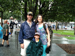
This mini-book will go (once I pick-up some glossy photo paper and print some photos) to my Dad. His health continues to deteriorate and he is on oxygen constantly. Here is a picture of him and Troy during our visit recently. .jpg) I decided to use the new (and easy) Bandanna Technique from my TJ newsletter. I love this technique, it is so easy and really quite relaxing. Perhaps a little time consuming but not bad really. The stamp set is Nature's Silhouette I.
I decided to use the new (and easy) Bandanna Technique from my TJ newsletter. I love this technique, it is so easy and really quite relaxing. Perhaps a little time consuming but not bad really. The stamp set is Nature's Silhouette I.
I also was able to use my NEW Scallop Edge Punch!! (Along the right edge.) I placed an order my last day as a demonstrator and ordered this punch along with a few stamp sets that I've really been wanting. :D ![]() Here is a glimpse of the inside made of clear envelops. I recently found this tutorial on Dawn's blog. Mine is slightly different in that my back cover is about an inch or or so longer and folds over the front to make that brown flap that the top cover slides behind. (Make sense?) I only put 4 envies inside since I figured I could put photos front and back.
Here is a glimpse of the inside made of clear envelops. I recently found this tutorial on Dawn's blog. Mine is slightly different in that my back cover is about an inch or or so longer and folds over the front to make that brown flap that the top cover slides behind. (Make sense?) I only put 4 envies inside since I figured I could put photos front and back. ![]() Thanks Bestsy and crew for the push and motivation to get this done for my Dad!
Thanks Bestsy and crew for the push and motivation to get this done for my Dad!
Stamps: Natures Silhouette I (ISC); Ink: Distress Ink: Fired Brick, Pine Needles, Faded Jeans; Staz-On Black; Paper: Whisper White, Chocolate Chip; Accessories: Clear Envies, Nestabilites, Scallop Edge Punch (SU).
06 August 2008
Dino Glow
I needed a card for a friend's son who is turning 4 today. Troy is at his birthday party now. *sigh* I thought that using my Dino-Mite set from SU (retired) would be a good choice. I also thought that it would look good using the Glowing Image technique from the current TJ newsletter.  Well, I started this last night and still spent a couple hours on it this morning! No the technique isn't difficult I just chose a bit much to have to mask and reverse mask! Also, I tried giving this a bit of Zindorf's brayering style which added time to the whole process. All this for a 4 y/o's birthday card! Oh, and my white CRAFT ink didn't want to dry! Even after I (tried) heat setting it.
This card is designed so that the Very Vanilla layer opens and is layered on the quartered sheet of Close to Cocoa. That is why there is a strange edge to the bottom, my c/s was buckled due to the heat gun.
Stamps: Dino-Mite (SU); Ink: Bashful Blue, Certainly Celery, Ballet Blue, Night of Navy, So Saffron, Chocolate Chip, Close to Cocoa, Creamy Caramel, CRAFT White; Paper: Close to Cocoa, Very Vanilla; Accessories: Brayer, Signo gel pen, Post-It notes, COPIC G21 (grass), 1" Circle punch (sun).
02 August 2008
Designer Tiled ISC
I was inspired to make this card by ISC's Challenge #9, Monochromatic Mania. It also uses a new TJ technique Designer Tiles.
I started off wanting to try out this new technique. Then I pulled some designer paper from my Far East Mat Pack (DCWV) that seemed to fall into the same color scheme (to meet the ISC requirements) and went from there. After I finished the top layer I looked at my Earth Elements to see what color fit the best and this Really Rust was perfect! I inked up the silhouette from Nature's Silhouettes I with CRAFT Really Rust. I'm so glad I used the craft because regular dye ink probably wouldn't have given enough coverage due to the texture of the designer paper. I matted the top layer onto a Really Rust with VersaMark on the edges to darken the c/s then layered that onto a folded layer of Really Rust. I cut the VersaMarked layer a tad bit small, but used it anyway. I really like how this turned out!
Stamps: Nature's Silhouettes I (ISC); Ink: VersaMark, CRAFT Really Rust; Paper: Really Rust, Whisper White, Far East Mat Pack (DCMV); Accessories: Xryon, Copper EP, heat gun.
01 August 2008
My SU News
I just thought I would announce that I am no longer a Stampin' Up! demonstrator. I let my demonstratorship lapse. I still love SU, I just couldn't get my business going here in Illinois and got worn out doing monthly classes only to have one (maybe two) people show up.
At least I won't feel guilty using various other stamp companies! ;)
Bandanna Congrats

Stamps: Baroque Motifs; Ink: Onyx Black (Versafine), Distress Inks: Broken China, Faded Jeans & Pine Needles; Paper: Basic Black, Tempting Turquoise, Whisper White; Accessories: White gel pen, black grosgrain ribbon, 1/16" hole punch and black brads.
Sorry if you received this multiple times, I was trying to 1) correct spelling and 2) correct paragraph spacing for easier reading.